And We’re Live!
Hello Friends,
It’s been a while since I’ve been able to have a workshop in person. I understand that it’s sometimes better to be online so you have people in different places, time zones and who would otherwise not be able to attend. It’s the pivot so many people made, from yoga studios to corporate meetings. But there’s something about having creative people working in a place together. And this workshop was something that I couldn’t really have taught online. If I’m honest, I don’t think I could have delivered a very good experience. So, I waited it out and found something I was inspired to teach and take people along with me and it turned out to be a great day.
Despite above average temperatures, we were shaded, open air and hydrated. By the end of the 3+ hours everyone had taken away something of value in the way of learning, mindset and creative art practice. I was happy that they were happy. That’s the best feeling when you deliver experiences such as these. I’m not sure I’d feel that way if I had done it virtually, and this workshop didn’t fit that model.
Here’s some pictures from the day and comments from the artists who attended.

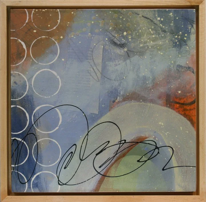
Nature inspired mark making.


Black and White marks were our starting point.

Everyone found something to make their unique marks.

Adding layers…

so that we could reveal and conceal our marks.

Less control makes for interesting marks.

One of a kind - that’s what we love about art!

And now we consider composition. A great exercise in noticing what we love and what we can do without. Less is more.
Susan had some kind words that summed it up and helped me realize that I had delivered something to be proud of.
“From conception to production, this nature inspired workshop was a joy. The materials and implements provided by Claude contributed to the students' feelings of freedom and surety, just what an artist needs.”
I hope to offer another workshop in the near future. It was such a pleasure to be among other creatives and have something of value to offer them.
Thanks for checking out the blog. Feel free to leave a comment. I’d love to hear your thoughts.
Have a creative week,
Claude
It’s All in a Name

Closing the Gap Art Quilt 29” X 27”
Hello Fellow Creators,
You know what time it is? It’s that time after I’ve finished a series, done the sealing and varnishing, frames are in transit and I have to create labels for my artwork. I know what the series is about. I know what feelings I want it to convey but I have to come up with 24 names for my upcoming show.
Here’s some things I have done in the past and my method for naming my work. First, I often name things after what is happening around me. The influence of external sights, travel and circumstances can’t help but seep into my artwork. The piece above was created during lock down in early 2020. I had no white fabric left to dye and small pieces of previously dyed fabric. I did however have a pretty impressive stash of vintage textiles. I decided to see what I could do and I made a series of several pieces that all had a lot of what I consider negative space. Coincidence? I think not. Then the pieces were pieced in small random arrangements and separated by the shades of white in the vintage textiles. Small groupings separated from each other. Coincidence? Not really. The piece at the start of this post is titled “Closing the Gap”. Wasn’t there a huge gap we were all feeling? I could have named it Separation or Social Distances but, that would attach a specific time to the piece. It would also give it a negative connotation - remember that terrible year?? I decided instead to name everything in the series something timeless and yet, related to that time. Here are some of the names I used for those pieces.
Far Reaching, Hanging by a Thread, Thinking Outside the Box, Circles of Influence and It’s Anybody’s Race (Remember that news cycle?) Timeless yet clearly influenced by the circumstances of the time.
I have pieces that have sold with names like “Nor’easter”. I made it during a day off of work because of, you guessed it, a nor’easter. I also have pieces who names I’ve struggled to find. Now I just sit on the floor, get grounded and look at the work. I ask it for a name and so far, I have been given some pretty good direction from the artwork.

Beachcomber #4 8” X 10” ready for framing
Another strategy that I use to name my pieces is to use a series name and just give it a number. The Beachcomber Series used stuff I had collected while shelling on all the beaches I had visited. It’s one of my favorite seaside pastimes. I also used this strategy for my Contemplations Series for a couple of reasons. First I had created 50 paintings so that’s a lot of names and second, it was about the mindset I used while I was making the work. You can hear more about the mindset here.

Contemplations Series 2 #4 10” X 10” X 1.5” on Cradle Panel
Now I have a series of 14 paintings and 10 art quilts that are in need of names. The art quilts are an interpretation of the winter landscape and so I will be considering names with that in mind. So far I have named this one “The Forest for the Trees”. I wasn’t sure during it’s construction what I was making - often the case in my abstract and non-representational work. But while hiking I looked around and it was a clear connection to me that this was the snow covered ground, the stark dormant trees and the grey skies of winter.

The Forest for the Trees is yet to be framed and measures 19.5” X 18.5”. But at least it has a name!
Finally, the latest series is about travel. I had the chance to get some travel time this winter and we headed south for a few weeks, 20 hours by car. We experienced St. Augustine, America’s oldest city. This recent series is influenced by the colors and vibe I experienced there. The beach house, the quaint city streets, the sightseeing and adventures of a new place. When I finish this blog post, I will be sitting with my paintings to give them their names. But this one already named itself.

Fountain of Youth 16” X 16” X 1.5” on Cradle Panel
I’d love to hear how you name your artwork. Please leave a comment of send me a picture. I’d love to see the work and see the connection to your title. Thanks for visiting the blog and I wish you a creative week!
With gratitude,
Claude
Art Quilt Meets Acrylic

Matte medium and acrylic paint on a vintage textile and book page art quilt.
Hello Fellow Artists and Art Lovers,
As you may know, I am formerly a science teacher. Twenty-five years in the classroom to be exact. When I tell people that, they look at me and say, “Oh, I would have thought you taught something creative, like art.” Hmmm. I’m not sure where people get the idea that science isn’t creative. After all, we do a lot of experiments. We start with a question or a problem and then set out to solve it. Which often in science leads us to another question. To me this sounds like perfect training to become an artist. Curiosity and uncertainty.
We have a question. What if - I mix these two paints, dye these different fabrics, scrape away paint or use this new technique? The possibilities are endless. Which always leads the artist, (and a scientist), to a new question. Ok, I mixed these two colors - what if I add white? black? paint over what I did and scrape into it? The what ifs are unlimited. Which is the perfect playground for the curious mind.
So, in my recent series of black and white art quilts, I have asked myself a bunch of what ifs. And today I am sharing with you a new way that I have devised for mounting and displaying an art quilt.
I asked what if I add red? What if I cover the piece with acrylic matte medium? What if I don’t want to put it under glass and in a big frame? How else could I showcase a piece? What if the edges are uneven? and so on.
I’m still working on the series and the ideas are coming to me only because I am making observations and asking the questions. Until recently, my studio has been divided into fiber on one half and paper and paint on the other half. It was inevitable that I would eventually combine the two. So for now, the paint and acrylic mediums are joining the art quilts. I imagine that further down the road, stitch will meet up with paper.
Here’s some photos of the series and how I am playing with the process. I hope you find something inspiring here. I encourage you to ask your own questions. One small idea that meets with another small idea can actually be a pretty big idea. I rarely get big ideas - but stringing together a bunch of small ones has been serving me pretty well so far.

I applied some cold wax medium to the sides of some 6” X 6” cradle panels and let it dry for about 30 minutes. Then I buffed it to a nice satiny finish. No one will notice this but, I like to have the work finished as nicely as I can.

I went to the local box hardware store and bought some stainless steel nails with thin shanks. Then I gathered my tools for the job.

I carefully placed my 6” X 6” art quilts on the cradle panels and tapped a nail in each corner, starting with diagonally opposite corners. I see the little frayed piece - I’ll have to trim that away.

I also added a nail at the midpoint of each side. If this were larger (and I have a larger one planned), I’d put them at whatever regular intervals make sense and securely hold the piece in place.

I had a couple of frames in the studio so I auditioned each piece in the frames. These are for 1 1/2” deep panels so these are recessed and I will need to use blocks on the back to raise them a bit.

I think I prefer the natural wood frame. Lightens the look and still feels contemporary. I’d love to hear your vote. Black or Natural? Feel free to leave a comment.
Thanks for checking out the blog. Feel free to leave a question or comment. Then go make something - start with “What two things can I put together?” That’s the big idea.
Reviewing Your Work

This is what I start with - YIKES!
All artists who create non-representational, abstract and even representational work will inevitably come to the question, “How do I know when a painting (or piece of art), is done?” Here are a few tips, tools and techniques that I have used and found helpful when I am getting to the end of a painting.

That’s a little better.
Cut a mat to the approximate size that you will be framing or mounting the artwork. Reduced the visual clutter of the extra paint and marks around the edges.
Hang it up and walk back at least 10 feet. Does it have appeal? Is there something about it that makes you want to take a closer look?

Use the paper or mat board that you removed from the center of your viewing mat and cut away one quarter. I have a 16” X 16” opening, so from the section I cut away I removed an 8” X 8” square. This gets trickier as you work larger but taping paper, even plain newsprint can be helpful to make this tool.

Place the mask over the painting so it covers each of the four quadrants. look at each quadrant at a time. Are they different from each other? Is there variety of value, marks, color, shape or whatever you are trying to engage the viewer with in your work?


Does each quadrant have something interesting? They don’t all have to. You can surely have a quiet area if you are highlighting something else. But there should be variety and something for the viewer to enjoy in each section of your painting.
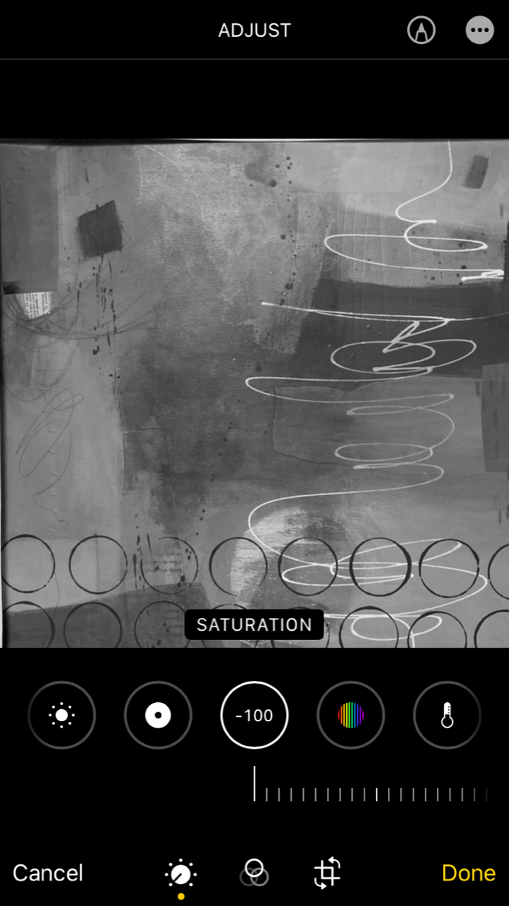
It’s useful to check for a variety of values in your work. If everything is very dark, light or midtone nothing will stand out and there will less visual variety. So, I use my phone photo editing and turn the saturation down to -100 or essentially, black and white. This allows me to see if there are dark, light and midtone areas present without the distraction of color (which can be quite deceiving).

Then I crop out the mat or paper so I have only the artwork.

Another useful tool is Adobe Capture. It is a free app that allows you to do several things with your photos. I find it very useful when I am critiquing my artwork. Fifth row, far right.
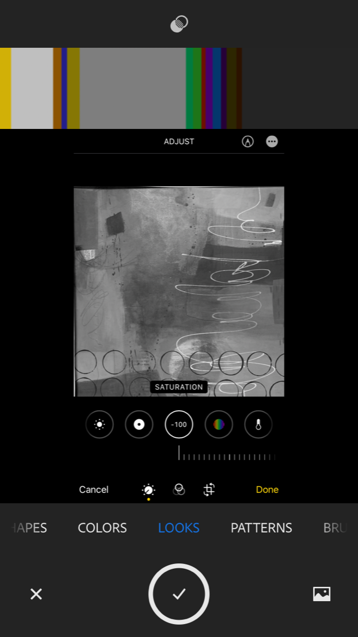
It has several useful features that you can check out if you decide to use this app. But, the LOOKS feature breaks down the image into light, medium and dark tones. It also gives you some proportions. Variety of value helps keep the work interesting and keeps the viewer’s eye moving.
This piece is part of my current series, scheduled to be in my June Featured Artist show at The ARTery Gallery in Milford, PA. I hope that these ideas had some value for you. I know that when I get close to thinking something is done, I like to check that I’ve hit some key art elements. It’s helpful and it can help with the question “How do I know when it’s done?”
Thanks for checking out the blog. Feel free to leave a comment or ask a question. I’d love to hear how you analyze your work when you are nearing the end of it. Please share so this blog can be a valuable resource for others. Thank you!
Have a creative week!
with gratitude,
Claude
Regaining a Fresh Perspective

The Rim Trail 13” X 13”
I was in my studio, just looking around. I have a lot going on in there. Currently, 16 paintings are underway - a series for an upcoming show. I also have 10 art quilts going. I was getting a bit stuck with the work because I kept doing what I know how to do - paint, splatter, add a pattern, stitch, etc. I love my creative work and I am always looking to push it further.
Realizing that I needed a fresh perspective in order to make these pieces “more” than I usually made, I decided to regain my beginner’s mind. Beginner’s mind is a meditation term that often means look at everything as if you are seeing it for the first time. Delight in wonder - have a childlike curiosity. Trust that whatever you know, you know nothing.
Of course, I know what materials and tools I have and I know how to use them. So, to boost my creative muscle I decided to try something completely new. Line dancing.
Yup, that’s right line dancing. I’ve never done it before. EVER. As luck would have it, I mentioned it to two people and within minutes, I had a Facebook post with details of weekly line dancing within a 10 minutes drive. If that’s not the Universe sending out support, I don’t know what more of a sign I could ask for.
Yesterday, I went to my first line dancing class - I guess it was a class, but really it was just a dance. I knew nothing - and everything was new - the names of the steps, the steps, the sequences and the people. I LOVED IT! I learned, I messed up, I laughed at myself and everyone there supported and encouraged me.
Today, I went into my studio and my work took on a whole new perspective. I let go of knowing where the work was going and I used a lot of paint to make bold changes to the paintings. Are they done? No. But, they are far more interesting than they were yesterday.
Will I go back to line dancing? Absolutely, what a fun and healthy environment. There are thousands of dances and it would take a lifetime to learn all of them - I imagine it is fodder for beginner’s mind for quite some time. (And it’s fun!)
How about you? What are you willing to try that you’ve never done before? Whatever it is, be willing and able to laugh at yourself. Honestly, if you take yourself too seriously that magic of childlike wonder will find someone else to bless with its graces.
I’d love to hear from you about what you tried. Also notice how you feel once you get back to that project you were stuck on.
Thanks for checking out the blog. I wish you a fresh, creative perspective on your week. You have my support and encouragement to try something new.
Claude

Earth Spirals 38” X 38”
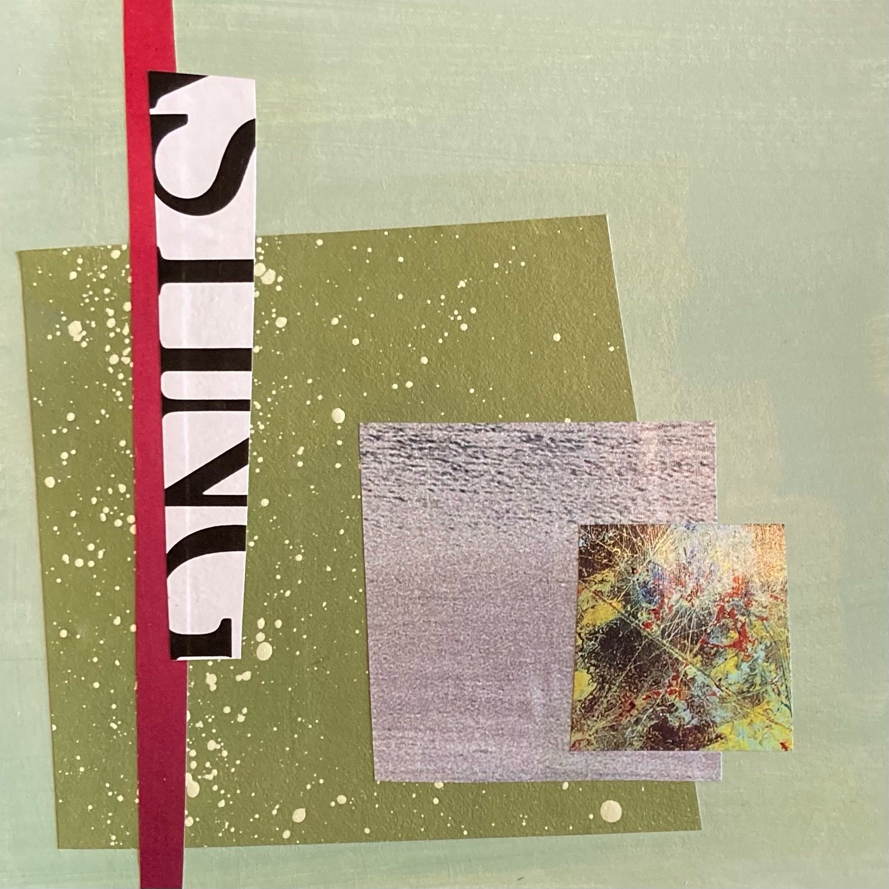
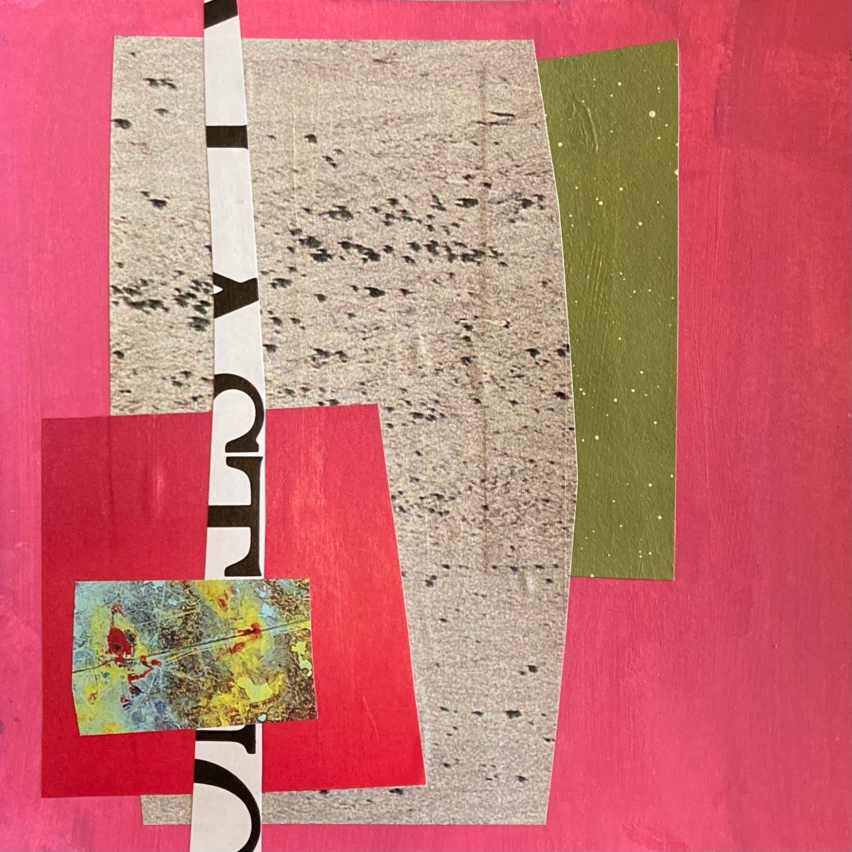
The 100 Piece Project

As I’ve said before, there’s a lot of people who want to get better at art and the “100 Day Project” has been very helpful for them. If I were still at my full time job, finding 15 minutes each day to create one small piece would be a great way to make myself accountable to growing my creativity. But, I’m now on my own schedule and when I set aside creative time, I try to set aside as much of it as possible. Which is why I decided that instead of making 1 piece every day for 100 days, I’m going to make 100 small pieces on the same topic, but not necessarily in 100 days. It might take longer - or it might not. I started 13 days ago and I have 18 pieces so far. I make them in batches and I am working on them two at a time. Here’s what I set as my parameters.
I pick two of my painted square papers - different colors.
I pick 5 pieces of paper from my collage stash.
I make a collage with those 5 pieces on each of the two different colors.
Once I get home from my travels, I can add one or two of the following: A scribble, a line, a splatter or a pattern.
That’s it. What have I noticed so far? The color of the background changes everything. The size of the collage piece in relation to the other collage elements and background make it either stand out or blend in to the piece as a whole. Here are a few examples with my observations.
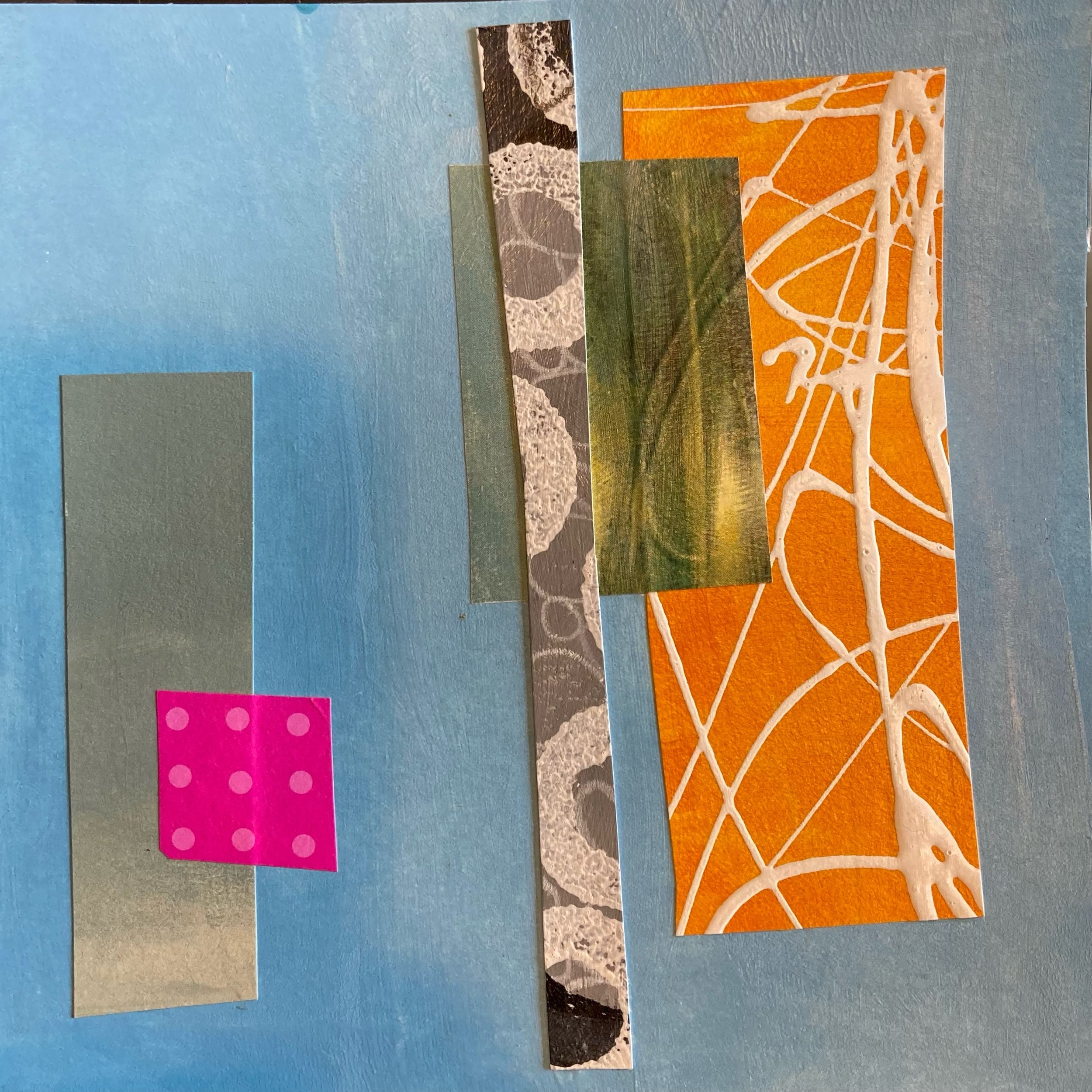
The warm colors (yellow and hot pink) really stand out but the muted colors blend in.
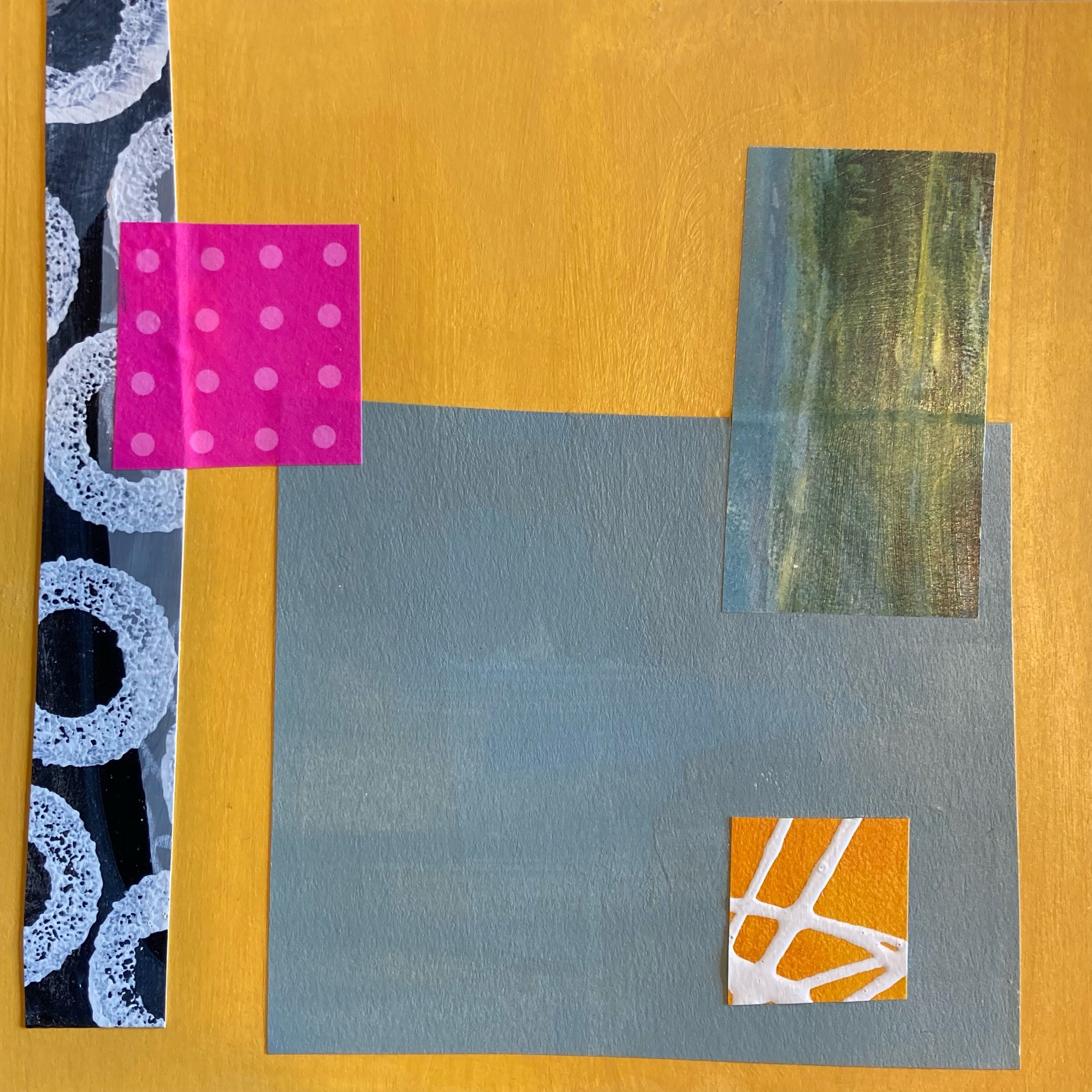
Same collage papers on a different background and the warm yellow doesn’t pop as much - although the hot pink still does. The black and grey has more impact than on the blue background.
This one is really about the magenta line, which is related to the magenta shapes from the magazine paper on the right.
Here the black and white incomplete letters and the muted green are more predominant.
You get the idea. I’m not suggesting you try this particular exercise. But, if there is something you want to get better at with your art making, create a small challenge for yourself. Make it manageable and with distinct parameters. The limitations actually cause you to get more deliberate with your choices. Here’s a couple that I have lined up so you can see how I start. On the right are the two painted background and on the left are the five collage papers.

You can see that I have some painted papers left over from past projects, magazine pages and sometimes I use the inside of security envelopes or old book pages.

The turquoise is an old birthday card envelope, there’s some magazine clippings, one painted paper and a book page. I am not using anything I think of as precious - it’s just for playing around and learning how elements can relate to each other.
So that’s how far I’ve gone on the project and for those of you who love math - I expect that half of my pieces will be below average. (The very definition of below average.) The point is that I’ll learn a lot by making 100 pieces and I won’t spend a lot of money or waste a lot of materials - which is often a concern. It’s a lot of knowledge bang for a few bucks.
Thanks for checking out the blog and if you have any suggestions for a 100 piece project, please feel free to send it my way. I’m having fun with this one but, there’s a lot to learn on the creative journey.
Have a creative week and I’ll be seeing you soon!
Claude
Here’s the counterpart to the one at the top of the blog. Very different - with only one change - the background paper.
Why I Work in A Series…
I used to make art in my spare time. After my full time job and on weekends when I could find some time. Back then, I had so little creative time that I was thrilled if I could make one piece every couple of months. But, as time moved forward and the kids grew up and moved out, I had more time. I got more serious with my creative endeavors and I had several pieces of art in the works at one time.
Now, I spend time in my studio several days a week. Because I love it and I have a place to exhibit it, as well as a website, I realized that I could work more prolifically in a series. Here’s the main reasons why it works for me.
It saves time because I am using the same color palette whether it is textiles or paint.
It allows me to explore what happens when certain colors are next to each other in a variety of pieces.
I learn a lot about color mixing and relativity - Bright red looks really bright when it’s next to dull green.
It allows me to create a body of work that can exhibit together and shows well in multiples.
When I am not sure what to do with a particular piece as I work, I don’t get stuck - I move on to the next piece.
Creating the limitations of color palette keeps me from over analyzing a situation and I can choose according to what materials I have laid out for myself. This keeps each piece relating to the others.
There’s less pressure to create one masterpiece because there are so many and you never know how each one is going to turn out, so the uncertainty makes each one less precious.
It really keeps me in a flow state. I get moving and everything is at my fingertips. I don’t need to think and the work comes together intuitively.
Here are some examples of pieces of work that are all in the same color palette. Cerulean blue, Quinacridone Nickel Azo Gold, Titan Buff, Black and White. They are in process, which is a nice way to say right now - They stink. But with each paint session some get better and some get worse. One by one they get finished and TADA! a body of work.


I love so many techniques. Mark making, painting, stitching, dyeing fabrics, monoprinting, the list goes on. But each time I work in a series, I try something. Maybe I like it. Maybe I don’t. If I like it, how can I change it so it looks different or repeats but with variety. If I don’t like it, how can I change it? What did I learn when things didn’t go well? I can then immediately apply what I learned to another piece. The rate of improvement is dramatic when you are working in a series. That’s what I’m working toward. Getting better with each and every series.
Do you work in a series? I’d love to hear what you like about it. I’d also like to know what you learn through the process. Feel free to leave a comment or ask a question here. I’ll get back to you after I clean my brushes and get out of the studio.
Happy Creating!
Claude
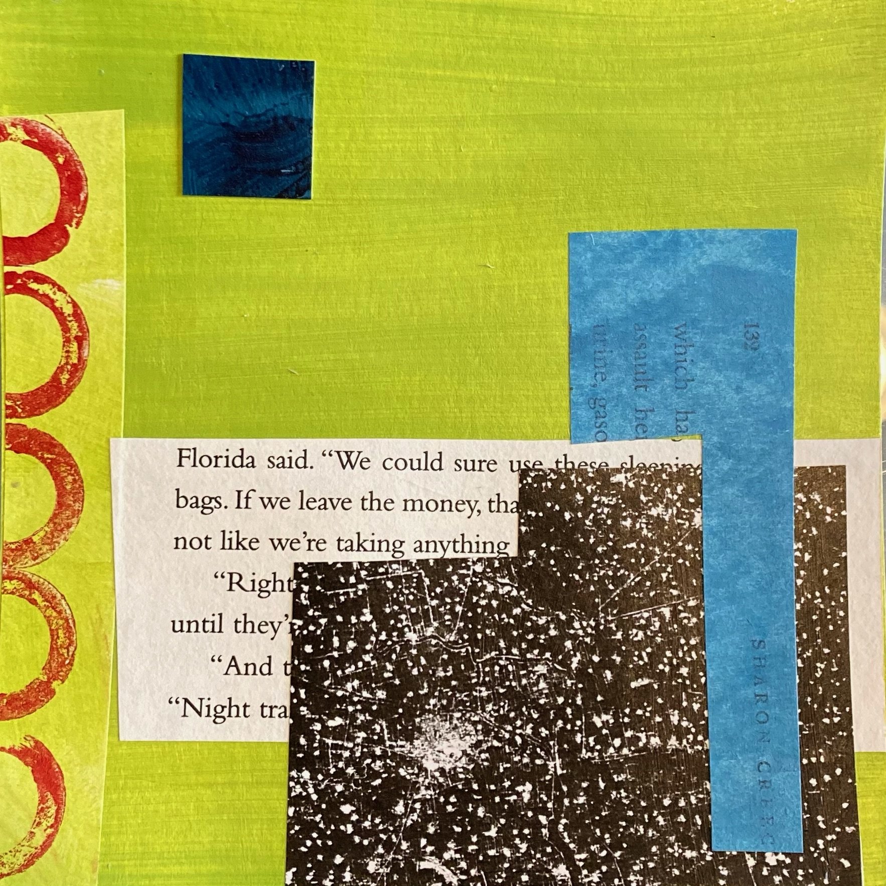
How to Make Art While Traveling
Collage Study
Hello Fellow Artists and Art Lovers!
I am happy to report that as this blog posts publishes, I am traveling. It’s something I haven’t gotten to do a lot of in recent time but, I’m finally packed and going places. It’s not anything crazy and not international - but it’s warmer and very different from where I live in Northwestern New Jersey.
Because we are driving, I was able to pack a few art supplies so I could play during the restful hours and evenings. I decided to make myself a 100 piece project based on a well known story. It goes something like this. There was a professor of ceramics who divided his class in half. To one half he said “I want you to make one pot. It must be perfect and the best pot you’ve ever made. A perfect pot will get you an A.” And to the other half of the class he said “I want you to make 100 pots. They can be any size, shape or design you want. If you make 100 pots, you will get an A. If you make 90 pots, you will get a B. Eighty pots equals a C and so on.” Guess who made the best pot? Yup. The students who made 100 pots. They weren’t paralyzed by the thought of perfection or of having to be perfect on the first try.
With this story in mind, I decided that I would do a 100 piece project. I won’t get bogged down with any one piece. What am I trying to accomplish? I am working on composition. How one piece affects every other piece of a composition. Here’s what I packed. What am I avoiding? The pressure to make them in 100 days. Why stop myself if I’m on a roll? Why work myself if I’m on the road - just make 100 and I know I will understand composition better. You can follow me on Instagram @claudeblarson if you want to see my progress.
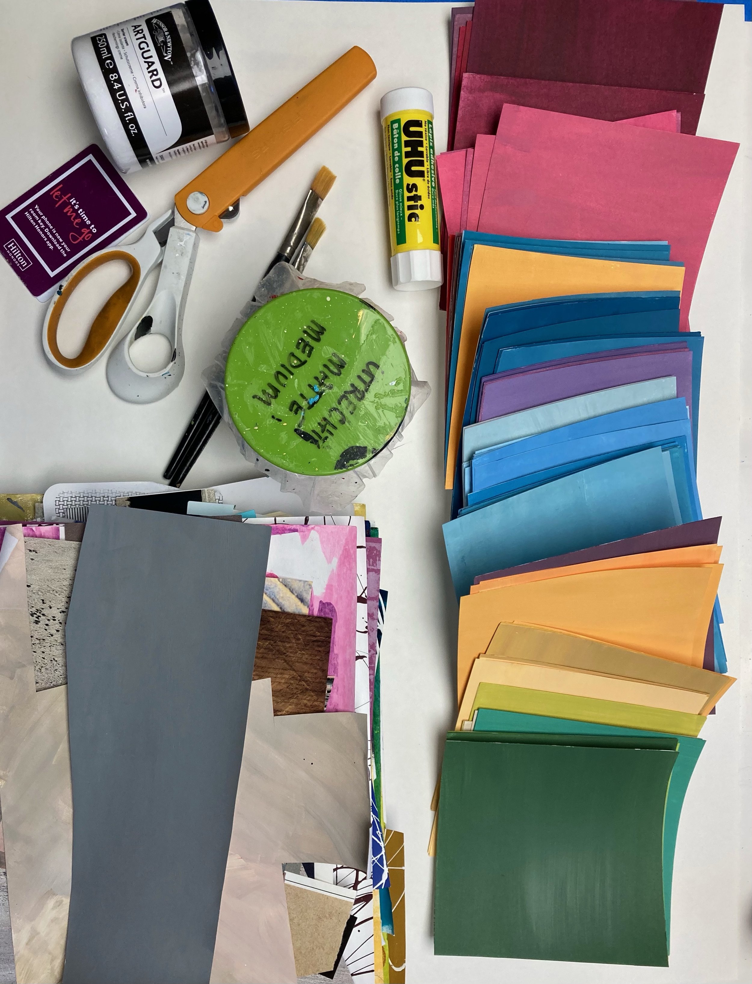
A collection of collage papers, 100 pieces of Bristol paper cut square and painted various colors (you can use white too), scissors, glue stick, matte medium, brushes, credit cards for scraping them into place and some art guard for my hands.
I don’t know about you but, there is an abundance of shipping boxes at my house. So I picked one that fit everything easily. And…

Just for good measure and because I had the space, I added water soluble crayons, various pencils and my Stabilo Woody pencils. I can fix the water soluble marks with matte medium if necessary.
I haven’t given my clothes as much thought or effort as this, but then which is more important? I’ll be seeing you from the road. Wherever you are, I wish you a creative day!
Claude

Collage Study
It doesn’t take a lot to make something interesting. In fact, I love negative space and highlighting the few shapes rather than visual overwhelm.
Stepping Into the Idea of Abstracted Landscapes

Agate 24” X 24” X 1.5”
This past fall I went on a mother-daughter trip to the American Southwest. We both love this part of the country and so we set off to do some hiking, adventuring and inspired retail therapy among the colors of Arizona and New Mexico.
I came home with the inspiration bubbling inside of me and the desire to paint landscapes was very strong. I don’t usually paint landscapes. In fact, I’ve never painted landscapes. The results are not exactly landscapes - I like to think of them as an artist’s response to experiencing a landscape.
The color palette was based on the colors of agate formed in the petrified wood of Arizona’s Petrified Forest National Park.

Petrified trees are strewn everywhere and the colors range from red, yellow, green and blue to a beautiful deep black. Like nothing you’ve every seen before.
We also visited White Sands National Park in New Mexico and Saguaro National Park in Arizona- but those series will have to wait for another day. If you want to check out the series, you can click the button below.
Thanks for visiting the blog. With the great case being made for vitamin D - perhaps you will take the opportunity to get outside in one of our national parks. I highly recommend it.
Please feel free to comment or share your national park, park or outdoor experiences. Since I’ve only just begun to try using landscape as inspiration, I’d love to hear how it inspires you.
Blue Mesa Trail 13.25” X 13.25” X 2.5”
The Inspiration of Winter

Scattering Seeds 12”X12”
There’s no time like the cold, dark days of winter to go in your studio and create things. The pull to be outside is less than in the warmer months so it’s easier to spend time indoors. I find that once the holidays are over and I can get back to a normal-ish routine with my days, I can always carve out more time for creating.
It’s not the first time it’s happened to me, but recently I have been inspired to delve into the realm of black and white. The simplicity, the austerity and the reflection of the skies and landscape in the winter months come together as I create with this very limited palette.
You can check some works in process pictures on my Instagram by following here:
I also have a video that gives some details about how I finish my paintings. It’s true that when people see artwork they are looking at what is the tip of an iceberg. Most of the work and process doesn’t really show in the final piece. My finishing process takes about a week and is done by adding seven layers to the painting. Only once the seven layers are applied, dried, buffed and ready to present do I call them finished. I hope you’ll take a look at the video detailing the steps here.
Feel free to send me a question, comment or share your own finishing process with me. We can all learn from each other - in fact, I highly recommend it as a part of your creative process.
Thanks for stopping by the blog and I wish you a Happy and Healthy New Year!

Eclipse 12“ X 12”
How to Make Your Holidays Happier
I used to give my friends and family pieces of my artwork on a pretty regular basis, particularly small art quilts. I was just starting out and I was working on sharpening my skills and just growing my creativity muscle. It felt good to give someone a piece of art that had come out better than I expected or better than anything I had previously made. And I was careful to give the work to someone who would appreciate it. I knew that when you are starting out, you can feel like a little kid giving someone your artwork. You just want it to be worthy of being pinned up on the fridge with a magnet. Anything more than that is a great boost to your motivation to continue. However, anything less is a crushing blow to your inner child and can really put a damper on your desire to keep creating.
When I decide to give my artwork as a holiday gift now, some 20+ years into my creative journey, I feel a lot more confident in what I present to the recipient. However, as an abstract painter and art quilter, I find that the only time I give my artwork to friends or family is when they express a sincere and specific interest in a particular piece. I understand that if they don’t like it or don’t connect with it, it can’t be secretly exchanged without hurting my feelings. They’re “stuck” with it.
When you look over your holiday list, consider a few things in order to preserve your creative mojo. First, did they express interest and specifically like something? Second, will they appreciate it and you will be as happy to give it as they are to receive it? If you don’t have a positive response to either of these questions, you should probably get them a sweater, small appliance or personal item that they would be happy to receive. This way you can feel just as happy giving them that item as they are to receive it. It’s the thought that counts. If you think (or know) they’ll like your work, give freely. If they’ve never expressed interest, then self-preservation tells us to give them something they know you selected with them in mind.
As the holiday deals and cyber shopping continue, I wish you peaceful moments of sipping hot chocolate, watching the winter season’s changes and stealing some time for yourself to just create because you want to.
Happy creating and stay tuned for more art inspiration in the coming months.
Warm regards,
Claude
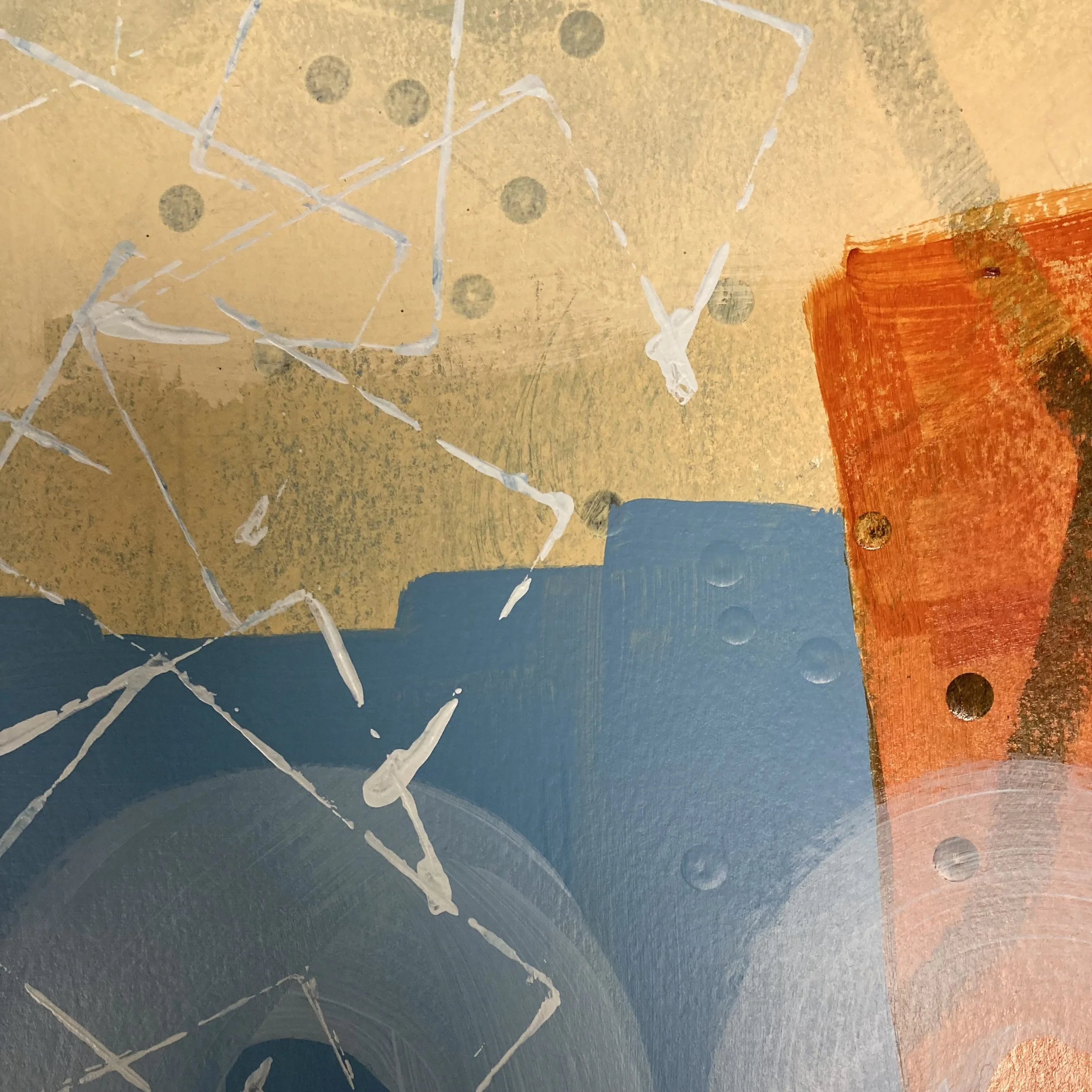
PS. Coming soon - The Petrified Forest Series
Here’s a quick peek!

Acrylic on Cradle Panel in solid maple floater frame 13” X 13”

Quilted Journal Online Workshop December 5, 2021 1 - 4 PM (Copy)
Materials List
This is a sample of the journal we will make. It is 5.5” X 8” in size.
Please have these collected and ready to go when the Zoom class begins. I will allow time for you to work. If you are searching for what you need you might feel rushed instead of relaxed.
one journal - hard cover any brand (for class purposes I recommend you begin with a smaller size such as 4X6 or 5.5X8. What you learn in class can be adapted to any size journal later, but in order to keep up with the sewing and assembly it's a good idea to start small. Possible brands: Canson, Art Alternatives, Daler Rowney, You can find these in box stores, art supply stores or Michaels. Here is a link as an example of what you are looking for.
sewing tape measure - flexible, not the kind used for construction
Scissors that cut fabric
paper and pen or pencil
straight pins
sewing machine that you are familiar with and know how to thread.
thread - all-purpose for construction and decorative for quilting (if you don't have decorative thread construction thread will work)
walking foot (optional but helpful for quilting)
Quilting ruler/rotary cutter or scissors and straight edge. If you have more than one quilting ruler, have them all handy.
Cutting mat or table surface if you are using a straight edge and scissors
fabrics of your choice I prefer 100% cotton because it is easy to work with. Polyester and blends can be challenging to work with when we get to the quilting, as they can slip or stretch in unexpected ways. (All together you will need about a quarter yard of fabric, a fat quarter or several different fabrics that you feel go well together.) The sample that I will demonstrate will have three different fabrics. That is a good number for you to start with. Again, once you know the process you can use as many fabrics as you like.
Thin batting - I use Warm and Natural or Warm and White. Fabrics stores often have similar batting in their own store brand. I find that cotton batting is easier to work with because it doesn’t slip against the fabric.
Have your device charged and in close proximity to where you will be working. If you can plug it in as you go, even better.
You will not to take any notes during the class, I will send you a PDF with all the instructions after class is over. Just come, follow along and create!
I’m looking forward to seeing you at the workshop!
Living Bigger
Maybe it’s the events of the past couple of years, or the realization that I have passed the halfway point of my life, but I want to live a bigger life. I’m not talking about money, power or material gain. The opportunities that excite me are the ones that push me to be better, to help others and to do the work required for personal and creative growth.
This year I had the opportunity to teach a cohort of young adults in a Youth Corps program. Using my own book, I focused on helping them grow personal habits that would support their success. It was rewarding, and it’s an example of living bigger. Extending beyond myself and impacting the lives of others in ways that are unique to my skillset. The ripples the students create from what they learned about themselves will be farther reaching than anything I may have helped them achieve. This blog post is not aimed at marketing the book. It’s just some of my thoughts about expanding my positive impact in ways that benefit others and feels fulfilling to me. If you are interested in helping teenagers and young adults experience more success, you can check out the book here.
Another opportunity was the decision to donate my artwork to an organization who’s mission is to help children living through traumatic situations. I’ve donated my artwork before. I pick a piece and then it becomes part of an auction and voila, the organization benefits. But this donation was more meaningful in its subject matter. Rather than just offering a piece of my art, I created this art for the sole purpose of donating it and the proceeds from the series to help others. I’m happy to say that the “Little Pink Houses” is finished, framed and ready for exhibit. It will be on display at The ARTery Gallery in Milford, PA later this week, as well as on my website. The proceeds will be given to Ginnie’s House. You can learn more about them here.
You can see the series here. John Mellencamp fans join me when I say Ain’t that America home of the free, yeah Little Pink Houses, for you and me.
Finally, for you fellow art quilters and makers, I have made a couple of videos about how I mount and prepare my art quilts for framing. If you make anything with some height that you want to frame, or if you have some heirloom pieces of quilts or textiles that you want to preserve and display, you may find these videos useful.
As always, thanks for joining me on the blog and feel free to leave a comment or ask a question. If you know someone who might find value in the information and videos I share here, please send them this link so they can sign up for my newsletters. Thanks and have a creative day!
Fear of Rejection
So often I want to enter shows that I think might be a good fit for my work. Then, every once in a great while, one prospectus comes along that is the perfect fit. Of course, getting selected from all of the submissions is always an unknown. I don’t know the curators preferences, the pool of other submissions or the vision they have in their heads of what they want to see in the exhibit. But, I put on my Kevlar jacket and send in my fee and fill out the application. After that I just hit send and let it go.
It’s taken me a while to realize that if one percent of people in the world liked my work, that would be a lot of people. And if less than one percent of people liked my work, that would also be a lot of people. The actual mindset I’ve adopted is “Do I like my work?” Because if the answer is yes, I’m fine with standing next to my artwork and saying, “I made this.” It can feel like a seven year old hoping that you’ll hang it on the fridge door with a magnet. And when people don’t want to hang it on their fridge, it can crush the inner artist child a bit. Except that I like it - and I can hang it on my fridge or wall or studio space and it makes me happy.
If your artwork makes you happy then you should put it up and enjoy the memory of how you felt when you made it, as well as be proud of where you were as an artist in that time.
All of this said, I’m happy to announce that my latest submission has been accepted to the ABSOLUTE ABSTRACTION show in Montclair, New Jersey at 127 Bloomfield Avenue. It will be on exhibit for the month of November. You can see the piece here.
If you’re at the point where you want to exhibit your artwork, I encourage you to do so. Find a local cafe, coffee shop or shop owner who will show off your creations. It takes someone who fits in the 1% category.
Thanks for checking out the blog and feel free to leave a comment or question. Have a creative day!
How I Use Sketchbooks…
It’s been all over the art blogs and Instagram. People are sharing their sketchbook practice and images of their sketchbooks. I used to never use sketchbooks because… well, I don’t really spend a lot of time sketching. I just paint or move textiles around and then something happens and honestly, it’s never something that I’ve planned. I have no idea where I’m going with a piece of artwork until it tells me where to go.
Recently though, I have created some sketchbooks for specific purposes. One to tape or glue in business and post cards from artists that I meet. Another to make swatches of colors that I might want to use to create a series of work. Just little things like that to help me organize my pile of post it notes and scraps of paper that I jot things down on. It’s a good studio practice and investing the time to do it actually does save me time later.
My latest sketchbook explores the concept is CONTRAST. Contrast is an important thing in artwork. It invites the unexpected and adds variety. If everything is the same in a piece, there’s no spark of interest. I often use the question “What don’t I have?” when I am painting to create variety and contrast.
In these images you can see the contrasting elements of art and my thoughts on how each element translate into a feeling in the artwork. I have about 25 pages altogether, but I’ve shared just a few here.

High Contrast vs Low contrast
Bold color shift vs subtle color shift

Density vs space

Balanced vs Unbalanced
Do you use sketchbooks? If so, how and what benefit do you get from making them? Leave a comment or ask a question.
Thanks for checking out the blog and I wish you a creative day!
Starting a new series...And you may already be a winner! (Read through to the end to see how.)
I have begun a new series that is linked to my limited and perhaps naive understanding of recent world events. I am generally apolitical but, I have been compelled to make some artwork based on my concern for children around the world who are facing hardship, family separation and total uncertainty about their future.
As I was pondering the situations while driving, the song “Little Pink Houses” by John Mellencamp came across my Pandora station. I realized that what I wanted was for everyone, everywhere to have a little pink house. A place where they would have a gentle life, kindness, safety and love. The color pink, in my opinion, represents all of these things.
And so I set out to create a series to express my concern. My progress is coming along well and my next step is to find an organization that would partner with me to use my art in a fundraising effort to help children have safe and gentle homes. It must be non-denominational - because I am struggling with this world-wide situation. I am open to suggestions. If you have some, feel free to share them with me.
For the time being, I am focused on making the art that will hopefully help fund some programs to help those who could benefit the most.

Hand dyed cottons, vintage linens, overdyed commercial fabrics and piecing and applique techniques. I still have some free motion and hand stitching to do.
Here are some goodies for you to check out from my website, YouTube channel and studio. Thanks for stopping by and I wish you a creative weekend.
If you would like to hold on to the last bits of summer, here is a new series that incorporates my beach finds.
Here is my latest You Tube Video with some ways to save money if you work with acrylic paint. Some of it relates to oils as well.
Last but not least, as a subscriber to my newsletter, you are currently entered to win a piece of my original artwork. It is part of my Gratitude Giveaway and I will draw the name of a winner on Thanksgiving Day and contact the winner via email. Stay tuned and watch for the email on Thanksgiving Day. Here’s a picture of the 10” X 10” piece of art. It’s ready to frame in whatever style frame suits your decor and I will be mailing it out right after Thanksgiving.

Constructed of hand dyed cottons, cross weaves and vintage buttons, this piece is part of my Simplify series. You can see a video about the series here at my You Tube channel.
Art and Ice Cream

For the past few weeks, I have had my show at The ARTery Gallery in Milford, PA. Once a year, I pull together my work and present it for public inspection and critique. It’s a daunting task. Not only because it requires a lot of work but, more so because it is an exercise in vulnerability. It’s as if I say to the gallery visitors, “Hi, this is my inner voice. My self-expression and the product of my recent efforts and skillset. What do you think?”
What the viewers don’t see is the whole picture of my artwork. They only see the finished product. Which is fine. That’s what I decided to show them. Because when I buy an ice cream cone, I know there was a cow, a farmer, a truck driver, an ice cream craftsman and a freezer builder involved. But in the end, I just want to enjoy my ice cream cone.
The dye stained fingernails and painted hair as I scratched my head is for my eyes only. The artwork that went in the trash bin or is sitting in a drawer, unresolved and unprepared for public display is not open to critique. They don’t need to see the dirty water and brushes that need cleaning. Or the mat cutting and tedious framing process. They don’t have to watch me as I ponder and stare at artwork that has yet to be resolved. The art should be like an ice cream cone. It’s just meant to enjoy.
That said, I hope you will come out this week and enjoy my work – it comes in many different flavors and I thoroughly enjoyed making it, both for me and for you.
“Artists’ Notes” Exhibit Dates: August 12th – September 6th 2021
The ARTery Gallery
210 Broad Street
Milford, PA 18337
Gallery Hours:
Monday and Thursday 10 – 5
Friday, Saturday and Sunday 10 – 6
Closed Tuesday and Wednesday
Collage Pieces Newly Posted
As I continue to build the website gallery and shop, I am posting three pieces that are available in the Collage Section of the Shop. These are a combination of collage and acrylic painting. All of them are on 2” thick cradle boards.
My work is a series of decisions that are taken one at a time. I make one decision and add something (or edit out something) and then take a look at what happened to the overall piece. Only once I have seen how the piece has changed can I decide what it needs. It’s a bit like cooking at times. Does this need salt, spice or a bit of butter to make it yummy? Except it’s more like does this need collage, pattern or a line to make it balanced?
You can visit my shop by following this link:
https://www.claudelarsonart.com/shop/collage
Please feel free to leave a comment or ask a question on this blog. I appreciate your visit and love to hear what you have to say. Thanks and have a great day!
Seeing Red 9” X 12” X2”
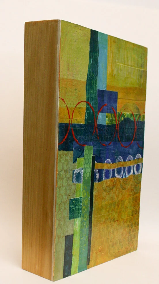
Seeing Red Side View
Circle Play 8” X 8” X2”
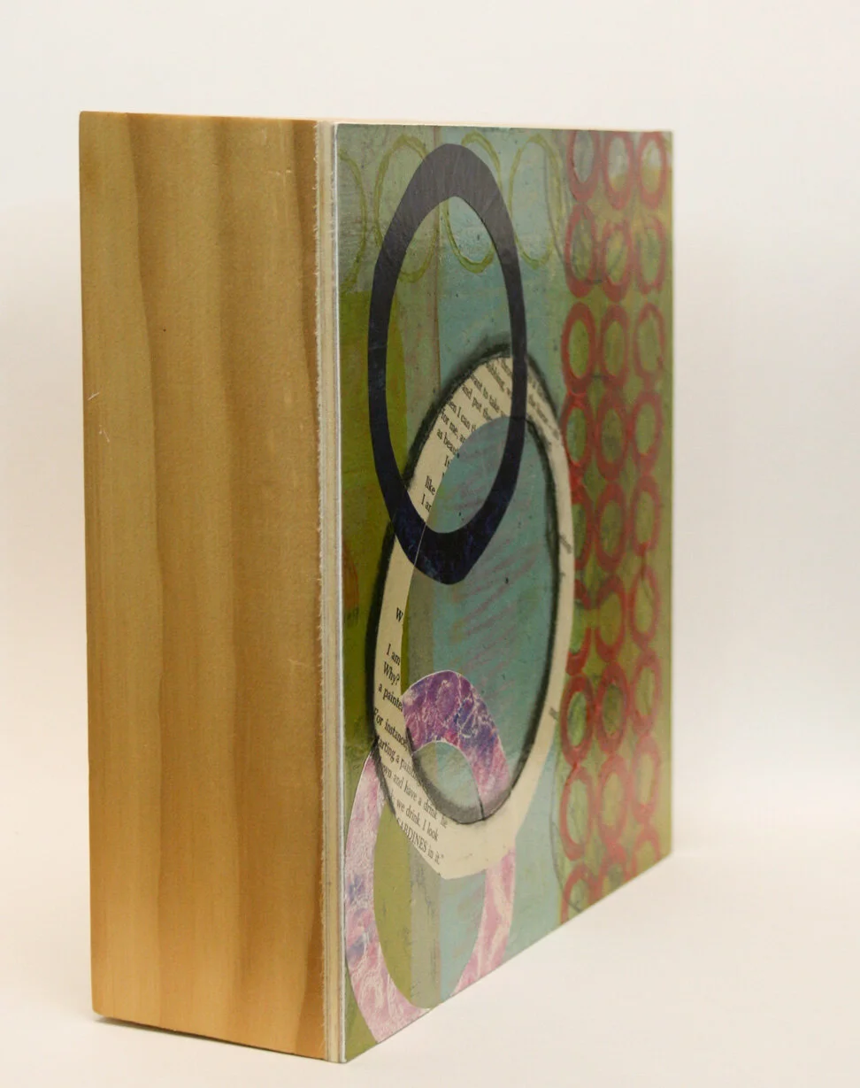
Circle Play Side View
What’s on the Inside? 6” X 6” X 2”
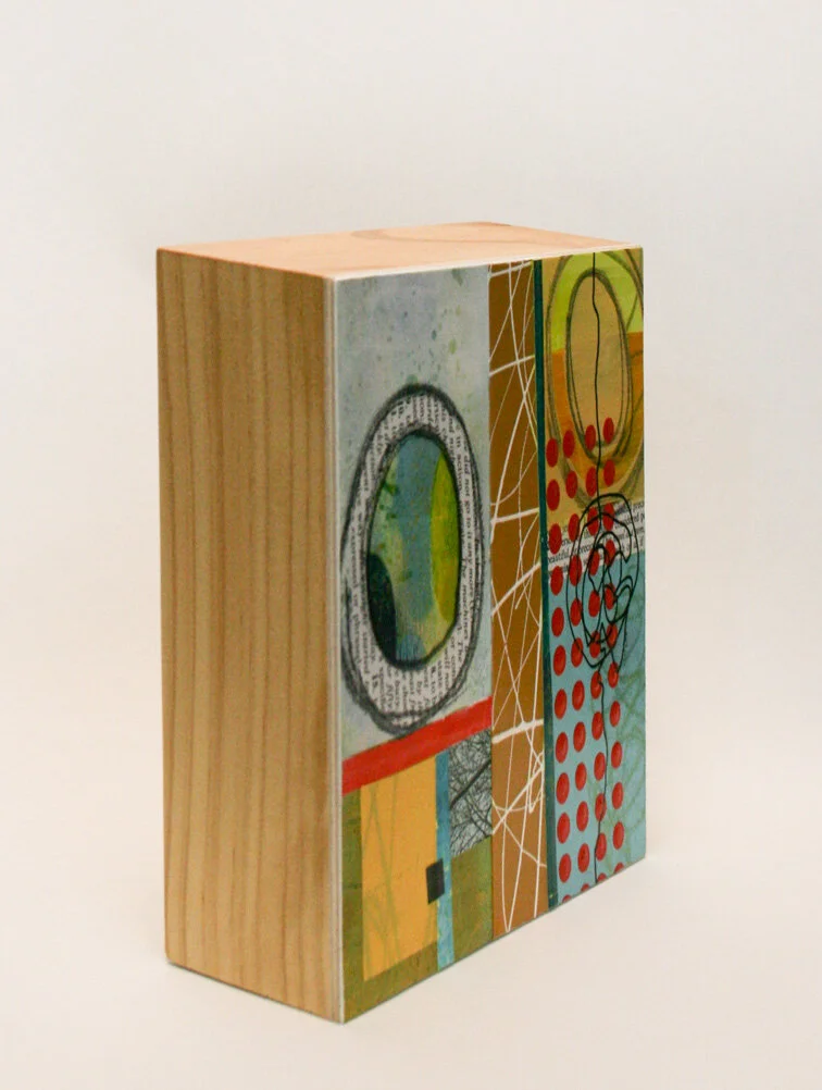
What’s on the Inside Side View
Never underestimate your ability

I wanted to build a website. That’s a really straightforward goal these days. Some people will go so far as to say that if you aren’t on the Internet, you don’t exist. I had a lot of companies offer to do it for me and the price range was wide! I decided instead to trust in my ability to problem solve and read and research and focus.
If you want to pay the nice people who will do it for you because you just don’t want to, then you should. But, I’m here to tell you that you can probably do a lot of it yourself. Sure, you’ll have to watch some video tutorials and you’ll click a bunch of stuff for a while before anything makes sense. But little by little, I build a website. It probably has some little typos or issues - but the beauty of that is now I know how to correct them. If someone else had done it for me, I’d be really lost. And possibly paying them to continue to help me.
I feel like building a website is a lot like creating my art. I start with the basics - fabric, paper, canvas, paint, tools and then I do stuff little by little until the artwork appears. It’s not an easy process but, as I go I learn stuff. I use what I’ve learned to help me solve problems later and I don’t get worked up over little things that need correcting later.
For today, apply this to your tasks. Before you ask anyone to help you do something, read up, watch a helpful video or just fiddle around until something works. You have great ability - and the more often you use it the greater it is. However, the more often you let someone else solve your problems, the less likely you will be to solve them yourself.
Thanks for joining me here on the newly located blog. Please leave a comment so I’ll know you’ve arrived!
Every ending is actually a beginning…
I’ve been blogging my art process and experiments for quite a while. Now, as I start my website, you can visit my older blog posts by clicking the button below. Going forward, I will be posting right here in one convenient place so you can find everything you want or need with just a couple clicks. Thanks for following along with me!